Catherine Selby AIA, LEED AP
“MJ taught me “it has to get ugly before it gets better” … probably the most useful advice anyone has given me in tackling design problems. Once you can let go of the perfect line or parti, you can dig into the program and come up with a better solution.”
Photo Credit: Dattner Architects
#WomenWhoBuild meet Catherine Selby AIA, LEED AP,
Catherine is a Principal with Dattner Architects, a New York City-based design firm creating engaging and impactful architecture around the world. Since joining the organization in 2007, Catherine has worked in the private and public sector on education, library, museum, healthcare and residential projects inclusive of programming, master planning, and sustainable, architectural and interior design. Her clients include the New York City Public Library, Princeton University, New York University, Lincoln Center, and NY Presbyterian Hospital, just to name a few. Prior to her career in Architecture, Catherine worked at the Shearson Lehman Hutton’s corporate art division, Colnagi USA, Ltd. old master art dealers, Interview Magazine’s advertising department, and research at Columbia University’s Graduate School of Architecture, Planning and Preservation, and Yale University’s School of Architecture.
ArchNative sat down with Catherine to discuss her career evolution, how her background in art history, commercial art, advertising, and sculpture, impacts her design intuition, the way that technology is impacting the planning and design of educational and health institutions, and her advice for her younger self.
What inspired you to pursue Architecture?
Travel, whether as a young child travelling back to the UK (where I was born) to see family and visiting stone structures from as far back as Roman times or as a teenager wandering around the streets of Paris to venture into the metro, museums, gothic cathedrals or viewing the city from the top of the Eiffel Tower; I have always gravitated towards architecture. And I realize now I made life choices related to the quality of space. For example, in college as an undergrad, I chose to study Italian over German because I preferred to enter the limestone and ornamental wood clad interior of the Casa Italiana at Columbia. The classroom was drenched in sunlight in the morning, and it was just a great space to be in.
How do you believe that Architecture school impacted and shaped your career?
New Haven is very small compared to New York City, and I admit that I was homesick. But I soon discovered the Yale Medical School Film Society focused on classic, avant-garde, and foreign productions and that was a way for me to escape into architecture through film.
My mentors during my time at Yale were formative relationships. One was Kent Bloomer who taught me that ornament was important in architecture even today. I was a TA for Diana Balmori, the landscape architect and wife of Cesar Pelli, and had the opportunity to work on a couple of competitions in her office in addition to a small design/build photo exhibit for her work in New York. That taught me about deadlines, material suitability and budget.
My studio mentors included MJ Long and Amy Anderson. MJ taught me “it has to get ugly before it gets better” … probably the most useful advice anyone has given me in tackling design problems. Once you can let go of the perfect line or parti, you can dig into the program and come up with a better solution. Amy taught us to think experientially about space using all of our senses…what does space feel like to the user?
I was also inspired by the raw corrugated concrete buildings of Luis Kahn (British and Yale Art Centers) and Paul Rudolf (Yale School of Architecture) – they were both modern, yet gothic at the same time.
How do you believe having a background in art history, commercial art, advertising, and sculpture affects your design intuition?
Art History was a springboard to architecture. In high school, I took an AP class in Art History and realized that most of that history is documented in our buildings – from ancient civilizations onwards. That interest continued in college where I majored in Art History (primarily buildings) with a minor in Architecture, which eventually led me to a career in Architecture via the Yale M. Arch program.
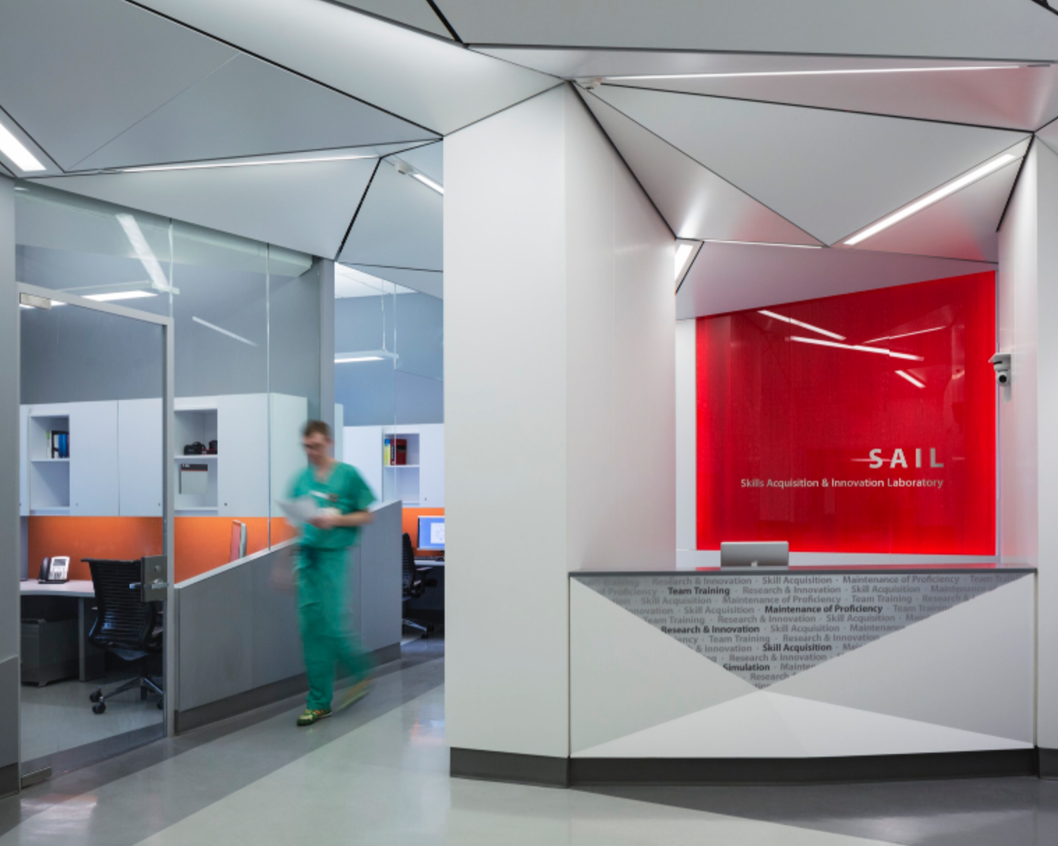
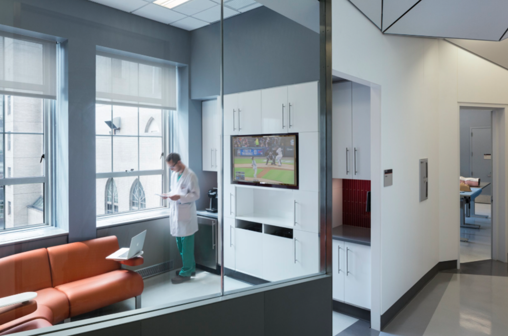
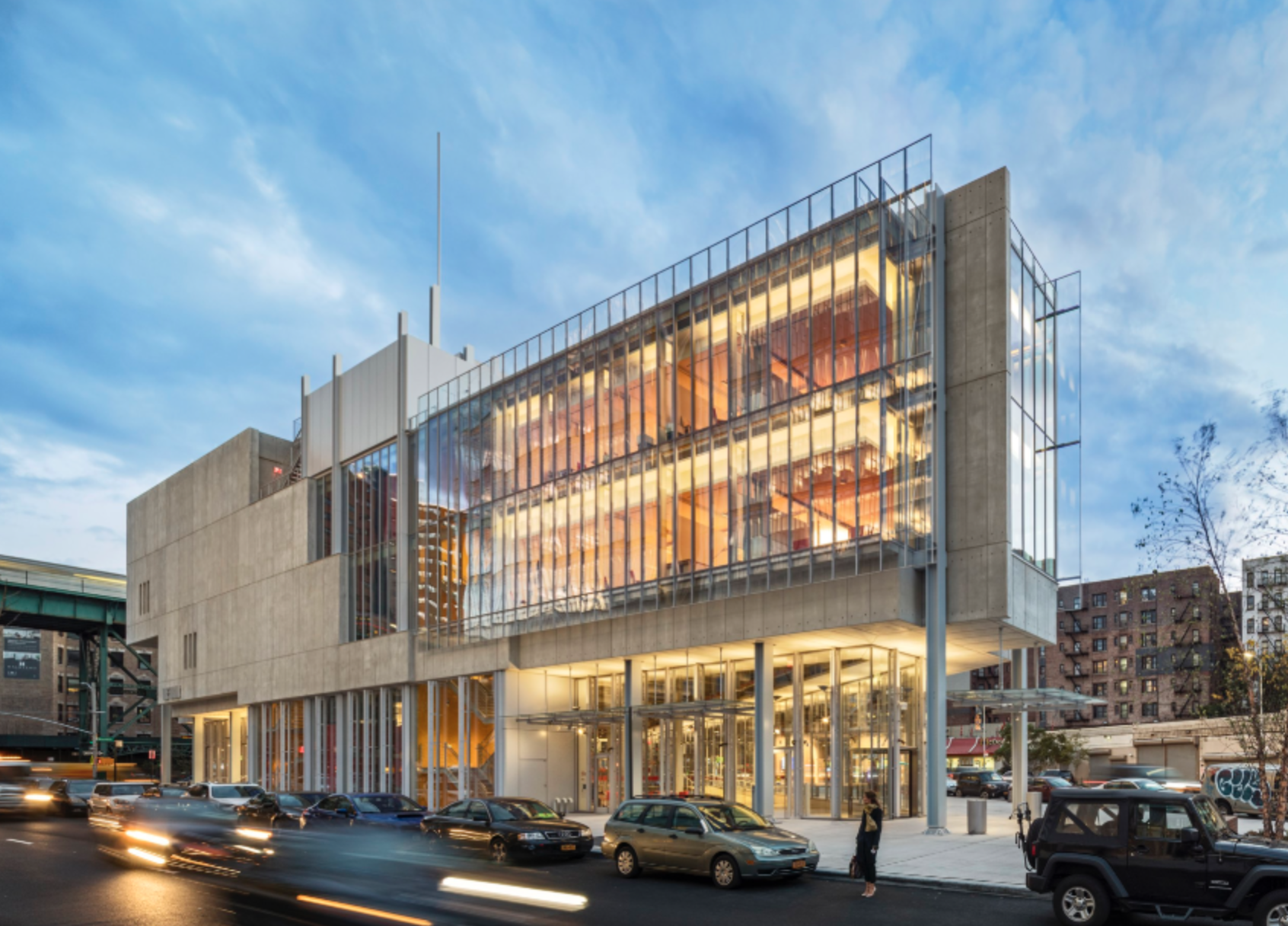
Project: The Forum – Columbia University
Credit: Francis Dzikowski / OTTO
How would you describe your career evolution?
My first job out of architecture school was in a small 6-person office for Michael Wurmfeld who also taught at Cooper Union. I worked on the Caldwell Fieldhouse expansion and renovation at Princeton University, and I quickly advanced from draftsperson to project manager when the PM left suddenly. Being mentored by Michael was great and it allowed me to jump in the deep end during construction. I worked with contractors as peers and that helped build trust quickly. That connection and respect for those you are working with is invaluable, as the solution to any problem is best conducted as a team effort.
How could you define your creative process?
One of absorption. It takes time to understand all the pieces of the puzzle that form a design challenge. I never get bored by this process and planning is one of the things that was driven into me doing healthcare work at LSGM (Larsen Shein Ginsberg Magnusson) Architects under Joe Shein and David Ginsberg. At the time I didn’t understand it, but good design comes from analyzing all the pieces and trying repeatedly until they come together seamlessly.
In your day to day work, what aspects translate to your passions as a designer?
A lot of what we do day to day is not necessarily design focused, but one can argue that the office is also a design problem and that collectively we all work towards creating a better environment for success so that Dattner contributions extend into the community reflected in our housing, infrastructure, education, and healthcare portfolio – places where people live and work. Helping guide the design process and mentor others is also important to me.
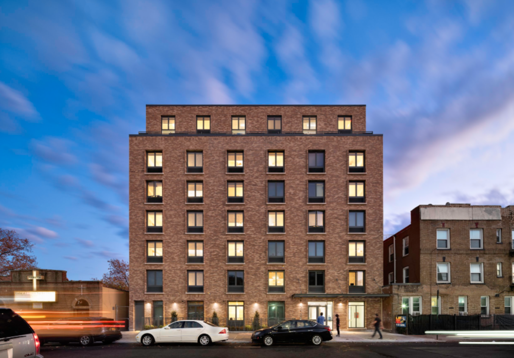
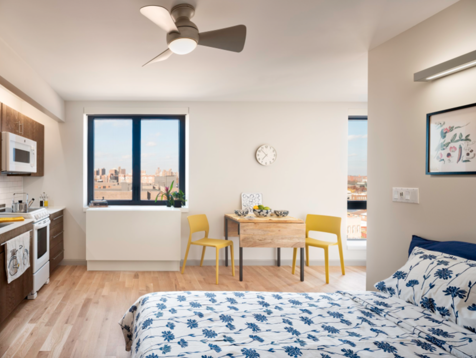
Project: Hegeman Avenue Apartments
Credit: Chris Cooper
What do you feel has shifted in your design method throughout your career so far?
Experience makes you pragmatic. It doesn’t mean there isn’t room for exploration and experimentation, but you are able to quickly rule out unrealistic options based on fee, schedule, and budget. That being said, there is a lot of design creativity which results from constraint. One of my first projects at Dattner is an example of this approach, where we took a traditional material – brick, and turned the building façade into a “tapestry” weaving together the (brick) colors of the Brooklyn neighborhood to creating a unique feature within budget. Good design doesn’t have to cost more.
Looking back, what have been the biggest challenges in your career? How did you manage through any setbacks or obstacles?
I think communication is a challenge at every step in one’s career and that you develop different techniques to read people and understand their point of view. This can be figuring out how to work with a new colleague or client. I can remember having difficulty with a principal I had not worked with previously, until we reached an impasse. That moment of friction helped us better understand each other and effectively work together and, in the end, it was a great project experience. My recommendation is that you need to get things out in the open to move forward.
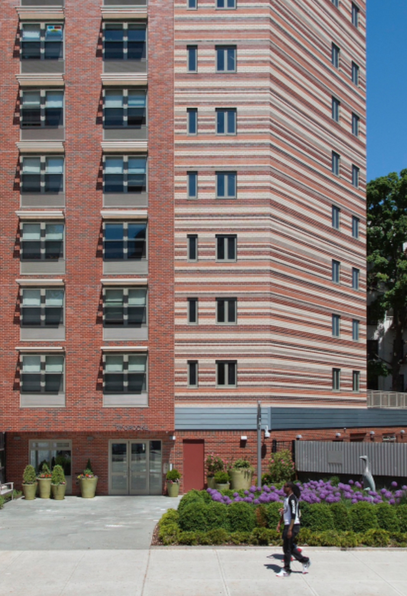
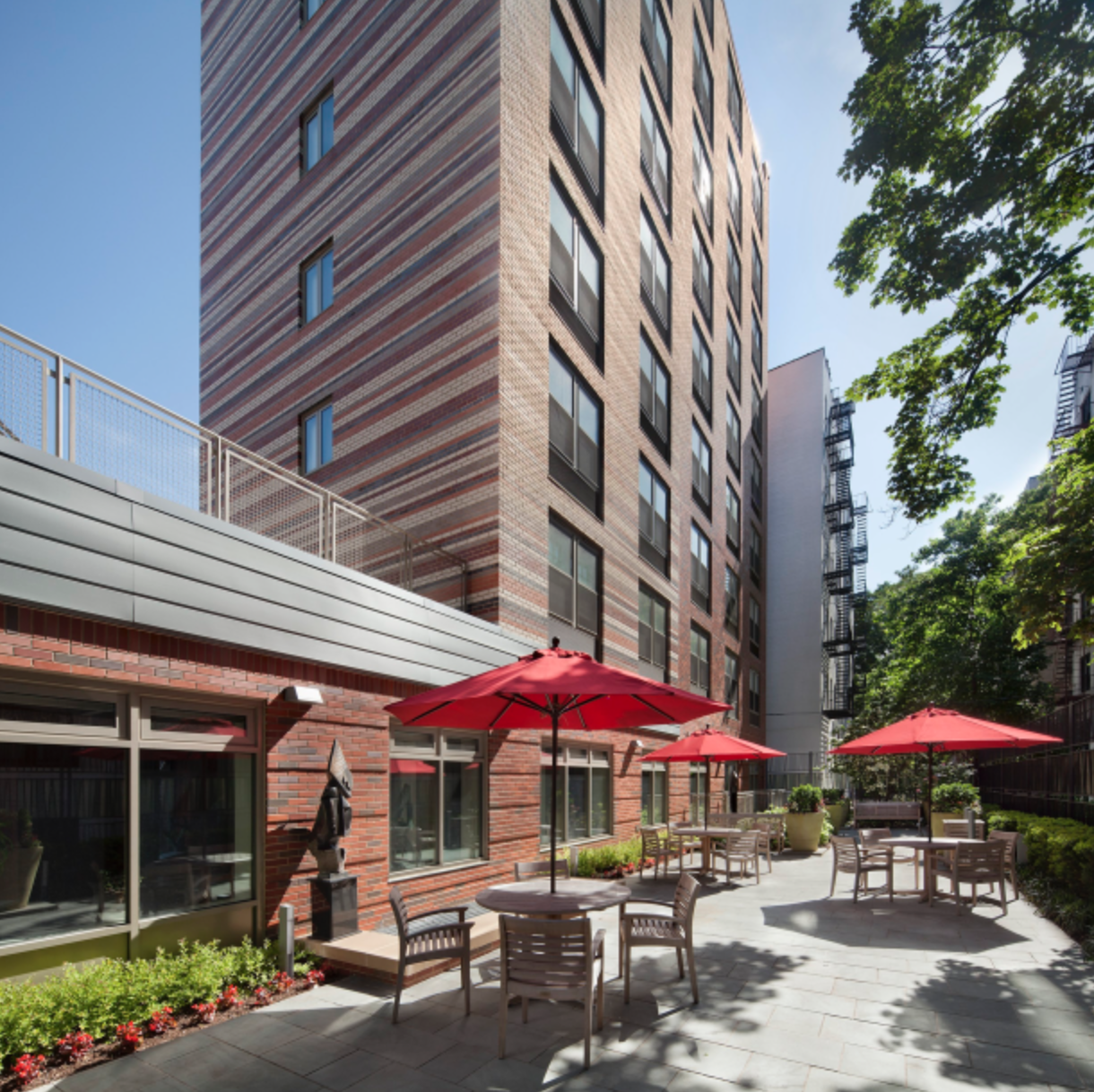
Project: 97 Crooke Avenue
Credit: Vanni Archive
Which of your projects do you feel has most addressed its community?
The work we have done with the non-profit CAMBA has been most gratifying in seeing how it has positively impacted the community and the tenants of these supportive housing projects. The first site we worked on was a logistics challenge - adjacent to the subterranean B/Q subway line and triangular in shape with only a twenty-foot street site access. Every decision was based on necessity and what was feasible given both physical and monetary constraints. It was such a great experience to creatively work with all stakeholders to find solutions and transform a difficult lot into a beautifully designed and landscaped development, that not only supports its tenants but strengthens the local community in creating a safer, durable more attractive neighborhood in Prospect Park South, Brooklyn.
Project: BCS Daycare Center
Credit: Ines Leong / L-INES Photo
What are your thoughts on technology impacting the planning and design of educational and health institutions?
I think that the tools we work with are extremely powerful, but with those new technologies our clients are more sophisticated and expect more of us in terms of presentation materials. There is a lot of data out there that can help forge new design from both a client and architectural perspective. Forecasting how spaces are going to be used now and in the future is key.
What would be one piece of advice you would give your younger self?
Ask lots of questions and get help if you don’t know how to do something. It’s a great way to meet people inside and outside of the office. Don’t get hung up on the little things or take things too personally. Take a broad view of each situation and focus on the outcome. Put yourself in the client’s shoes to understand what really matters and what doesn’t.


